Refocusing the candidate portal dashboard on job search, backed by data.
My role: Lead designer & Researcher
Team: Product manager, Lead designer & researcher (me), Portal development team
Background
In 2023–2024, I led the unification of three separate brand portals (Trustaff, Fastaff, USNursing) into one Ingenovis Health portal and app.
Six months later, usage data surfaced a new problem — this case study covers the fix.
The Problem
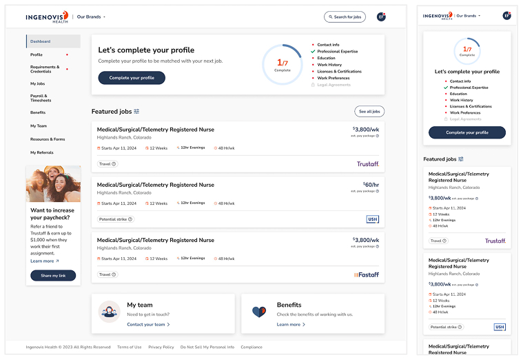
New users saw a profile-completion prompt before job search, pushing job search below the fold and lowering engagement.
The Goal
Refocus the dashboard so job search is the first thing users see.
Redesign the layout, and introduce a lighter way to collect profile information over time instead of all at once.
Timeline: Research & design, December 2024 – March 2025. Released June 2025.
Research
Who we're designing for
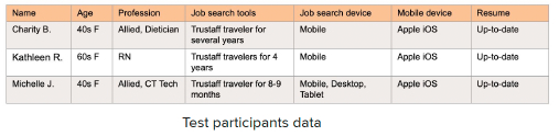
Nurses and allied health professionals searching for travel or per diem jobs
Use the portal to manage job applications, profiles, and credentials
Age and gender vary by brand — from a younger, majority-female Trustaff audience to an older, near-retirement-age USN audience
Competitive analysis
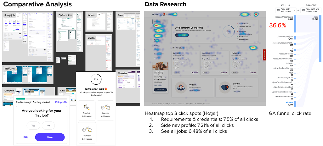
I benchmarked 9 competitor job platforms to see how they balanced profile completion against job discovery.
The data made the problem clear
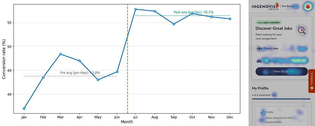
Heatmap and funnel data confirmed it: 36.6% of users dropped off between the dashboard and the jobs page — our biggest funnel leak.
Design & Iteration
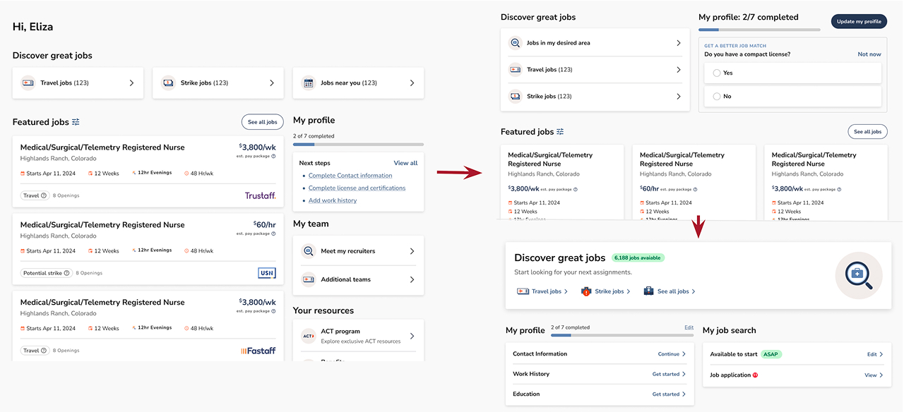
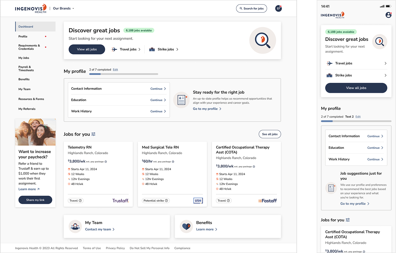
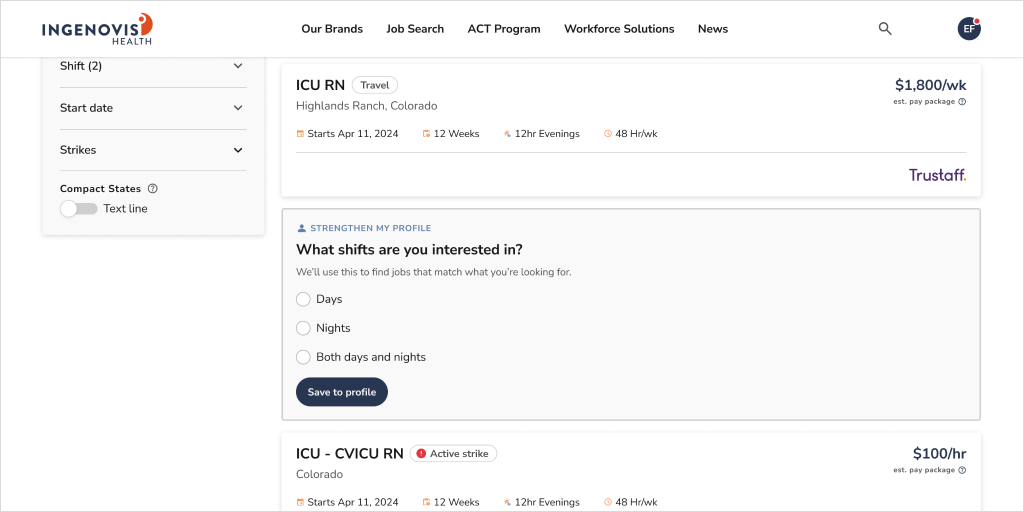
Over dozen of workshops with the product manager, we refined the layout — landing on a design that moved the profile section below the job promo card and added a small, in-context question to collect profile info gradually.
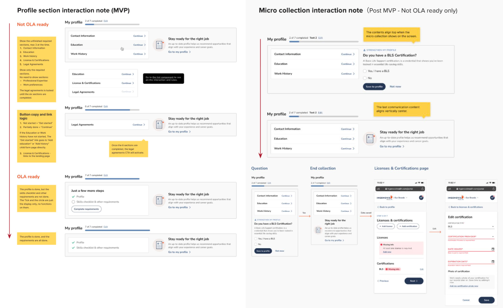
Profile completion moved from one long form into small, contextual prompts, showing up to 3 unfinished sections at a time. The “My Profile” module was also resized and moved down the page to make room for the job promo at the top.
Final Design
New components creation for MVP
A promo card
A list component
A linear progress bar
A refactored Job card
A micro collection pattern
Usability Testing & Rollout
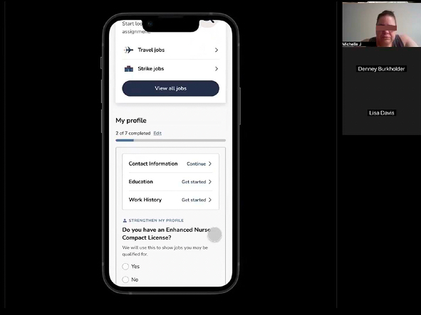
Usability testing on the new dashboard found feedback was positive overall — users described it as more focused and easier to use.
We released the redesign in stages, module by module, monitoring performance at each step and adjusting based on real usage data before rolling out further.
Results
Dashboard-to-job-search conversion rose from 43.8% to 56.5%, a ~29% increase.
Comparing the six months before launch (Jan–May 2025) to the six months after (Jul–Dec 2025).
Feature Spotlight: Micro-Collection
Instead of a long upfront form, the micro-collection pattern asks one short question at a time, in context.
We originally designed it for the dashboard, but shipped it on the job search page instead. Launched July 2025, the feature has been a strong performer: